Styles and Formatting
-
Do you prefer the old format (what you see right now), or the "new" format (what you saw yesterday, 1/14/21)?
-
@administrator said in Styles and Formatting:
Do you prefer the old format (what you see right now), or the "new" format (what you saw yesterday, 1/14/21)?
Yesterday’s was fine, as long as any quoted text is smaller and/or lighter than the newer reply text.
The old format looks pretty jammed-up...it’s a little difficult to tell where one post ends and another one begins.
-
Content, my friend, is what this site needs. Content.
Benge 3X
Martin Committee
Getzen Capri Cornet
Adams F-1 Flugelhorn"If you don't live it, it won't come out of your horn."
Charlie Parker"Even if I could play like Wynton Marsalis, I wouldn't play like Wynton Marsalis."
Chet Baker -
I agree with Dale. The new format is nice in that it is spread out a bit and has (if I recall) a larger font. But reconsider the font styles: the new post should be the boldest/darkest/largest font, while the quoted items should be less so. And the signatures should be the smallest/lightest font, perhaps even italics as with the old style.
-
Well, at the moment, 1/14/21 is still today, not yesterday.
I like the look of this version, but I would like the "Reply as topic" button to be at the bottom. Having to scroll to the top to do this is awkward. Also, in this version, I can scroll the comments if I want to see what someone posted while I'm composing a reply. If I recall correctly, this wasn't possible with the other version. I have the opposite impression than Dale Proctor; I find it easier to distinguish posts on this version than the other one.
Good luck creating a format that works well for everyone!
'62 Olds Studio Trumpet
'67 Olds Special Trumpet
2013 Dillon Pocket Trumpet
'83 Yamaha YFH-731 Flugelhorn
1919 York Perfec-Tone Cornet
'50 Olds Studio Trombone
Shofar"If it was just up to me, I'd only have trumpet players on my show." - Jackie Gleason
-
@j-jericho said in Styles and Formatting:
Well, at the moment, 1/14/21 is still today, not yesterday.
...I have the opposite impression than Dale Proctor; I find it easier to distinguish posts on this version than the other one...
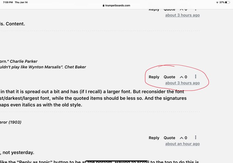
This is what I was talking about. The reply, quote, etc. line belongs to the post above it, but it’s hard to tell, because the “about 3 hours ago” line belongs to the post below it. There needs to be some separation between the two so you don’t accidentally reply to the wrong post.
1977 Bach Strad ML 43 trumpet
1960 Conn 6B Victor trumpet
1982 Bach Strad ML 239 C trumpet
1970 Olds Ambassador Eb/D trumpet
1993 Bach Strad L 184G cornet
1962 Conn 9A Victor cornet
1890 Besson A/Bb/C cornet
1870? Henry Lehnert SARV cornet -
Newer format.
-
@dale-proctor said in Styles and Formatting:
@j-jericho said in Styles and Formatting:
Well, at the moment, 1/14/21 is still today, not yesterday.
...I have the opposite impression than Dale Proctor; I find it easier to distinguish posts on this version than the other one...
This is what I was talking about. The reply, quote, etc. line belongs to the post above it, but it’s hard to tell, because the “about 3 hours ago” line belongs to the post below it. There needs to be some separation between the two so you don’t accidentally reply to the wrong post.
I see what you mean now. Thanks for clarifying. I had to double check this response to you; the first time I responded to myself. I discarded that one.
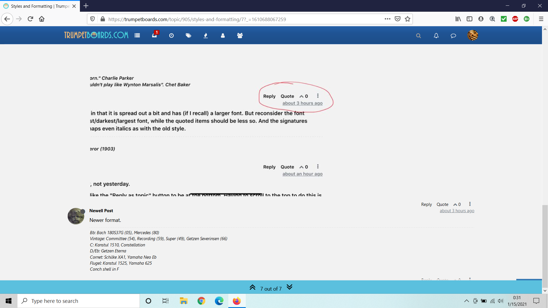
I noticed that I couldn't respond to Newell Post because of a blue line listing the post number blocks my access to do so. See below:
-
@kehaulani said in Styles and Formatting:
Content, my friend, is what this site needs. Content.
What? You aren't in the state of peaceful happiness?
I believe many here are at peace and happy, myself being such an example.
-
I did not see any new format. In any case, what aggrevates me most is "wasted space" that makes me have to scroll to see even only a couple of lines. Facebook is my biggest loser 2020 in this respect.